This post is also available in:  Italian
 Spanish
 French
This year EazyCity celebrates the tenth year of activity.
Our agency walked a long path since 2004, when it started with a small office in Cork: our founders Julia Lynes and Enrico Zoppi were young, but they knew that the Internet was the best way to be found by foreign people who wanted to move to Cork.
Here is a short history about the evolution of a small website that in ten years has become the point of reference for thousands of people that want to have an experience in Ireland or in the UK.
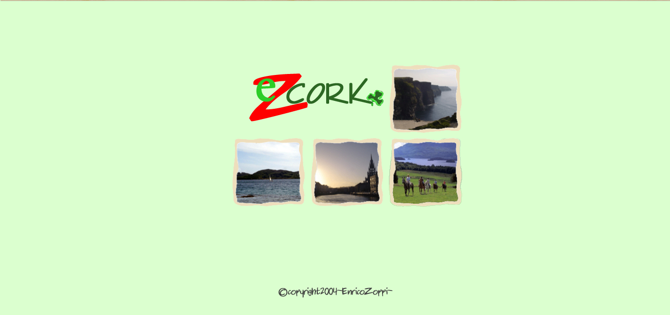
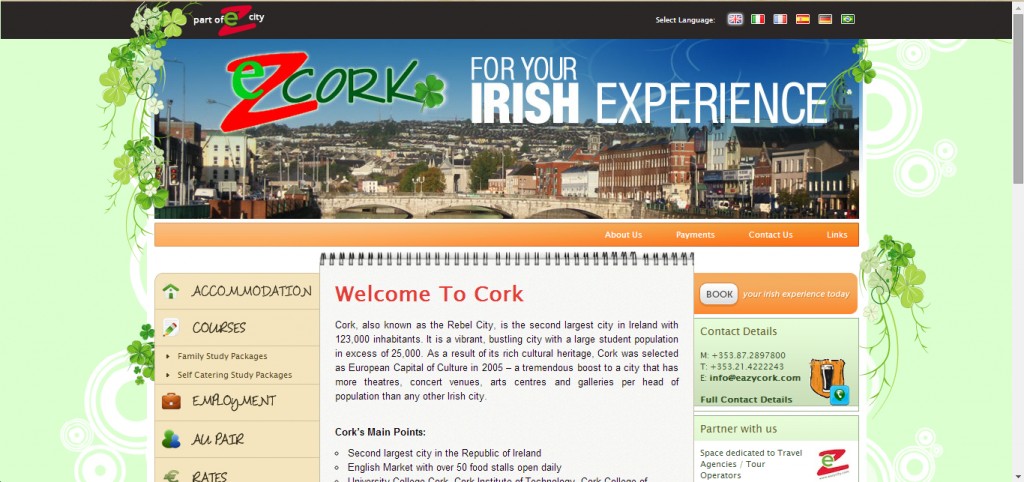
A background as green as the Irish hills and a clear logo, easy to recognise: the first landing page of eazycork.com looked like this.

Clicking on the page, you would have entered the actual site.
A scratch pad would have introduced you to Cork and to the company. No links, no many other pages; If you were looking for further info, you could have called or sent an email (the email address never changed, the phone number did).
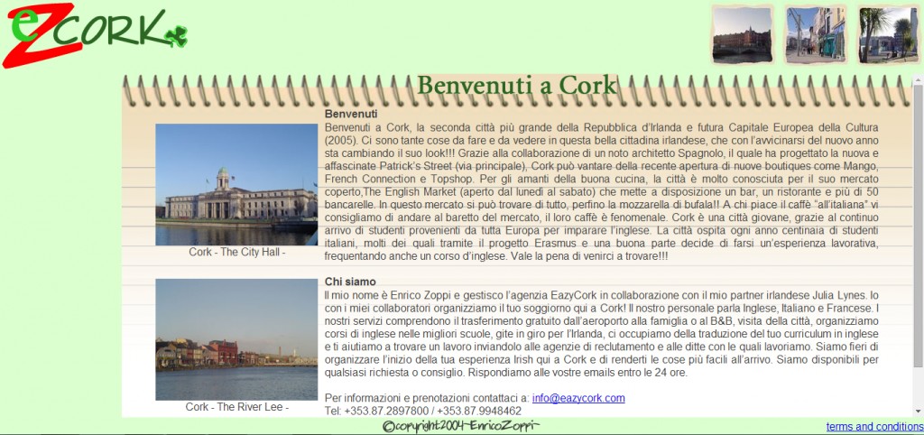
2004 looks so distant, from an Internet point of view, doesn’t it?
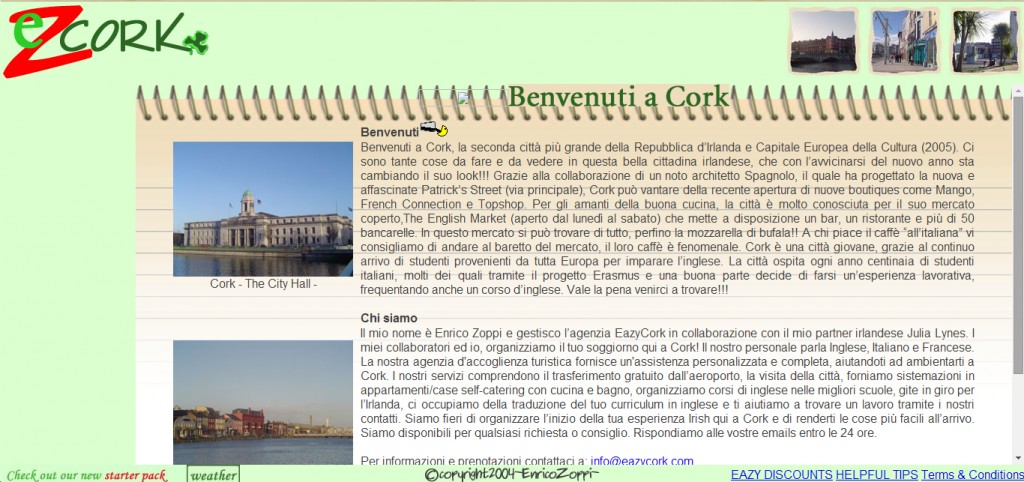
In 2006 the site was updated for the first time: the graphic didn’t change much, but we added some pages (Helpful tips, Eazy discounts, Starter Pack) and an emoticon drinking a stout. Sorry, we can’t remember if it was a Murphy or a Beamish.
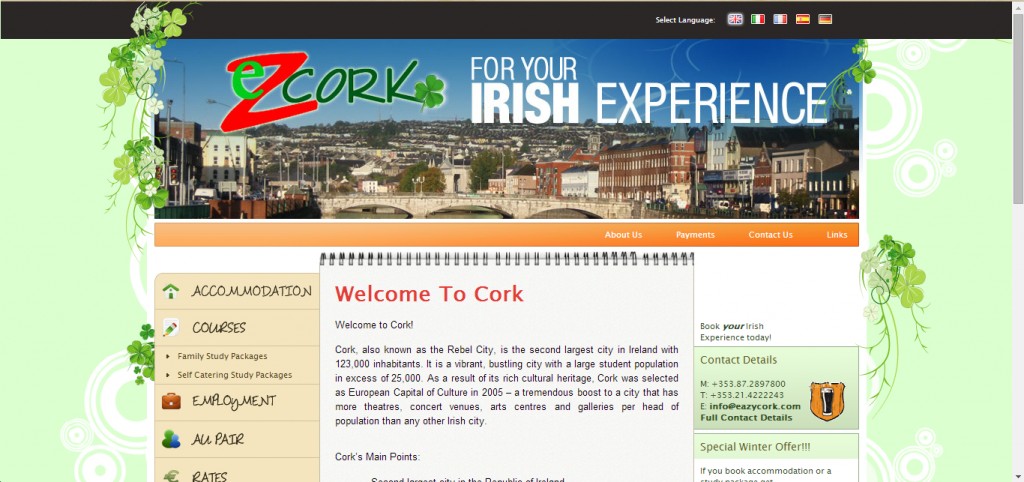
2009 is the year of the big change. The previous year EazyCork had opened a branch in Dublin and had become EazyCity, so our online showroom had to turn into something different. The site became Multilanguage, the graphic changed, EazyCity offered more services on the site and even the possibility to pay on line.
Another leap through time and we are in 2012: not many differences, the text was reviewed, we added the Brazilian translation and the possibility of booking your experience on line, directly from the site. Probably, this is the version of the site most of you knows.
And now? Didn’t we mention that EazyCity has a new website? It is brand new, we launched it just a few days ago. The graphics have changed with way more pictures than before, the menu is clearer and we have also improved the payment page.
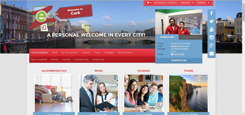
We worked hard on the new website, because making your experience easier is our goal since 2004, even when it is an on line experience.
If you haven’t visited our new website yet, here is the link.
And please, don’t forget to join our social pages.

